Case Study: Data Science & Analytics
The Michigan Paradox
Turning three raw Michigan public datasets into the data story that won 2nd place at the Michigan Business + Tech Datathon.
Data Analysis & Science
Product Design
Competition
Michigan Business + Tech Datathon
Timeframe
Feb 1 – Feb 6, 2026
Role
Data Scientist (solo)
Team
2 Business Analysts, 2 Strategists, The Data Scientist
Tools


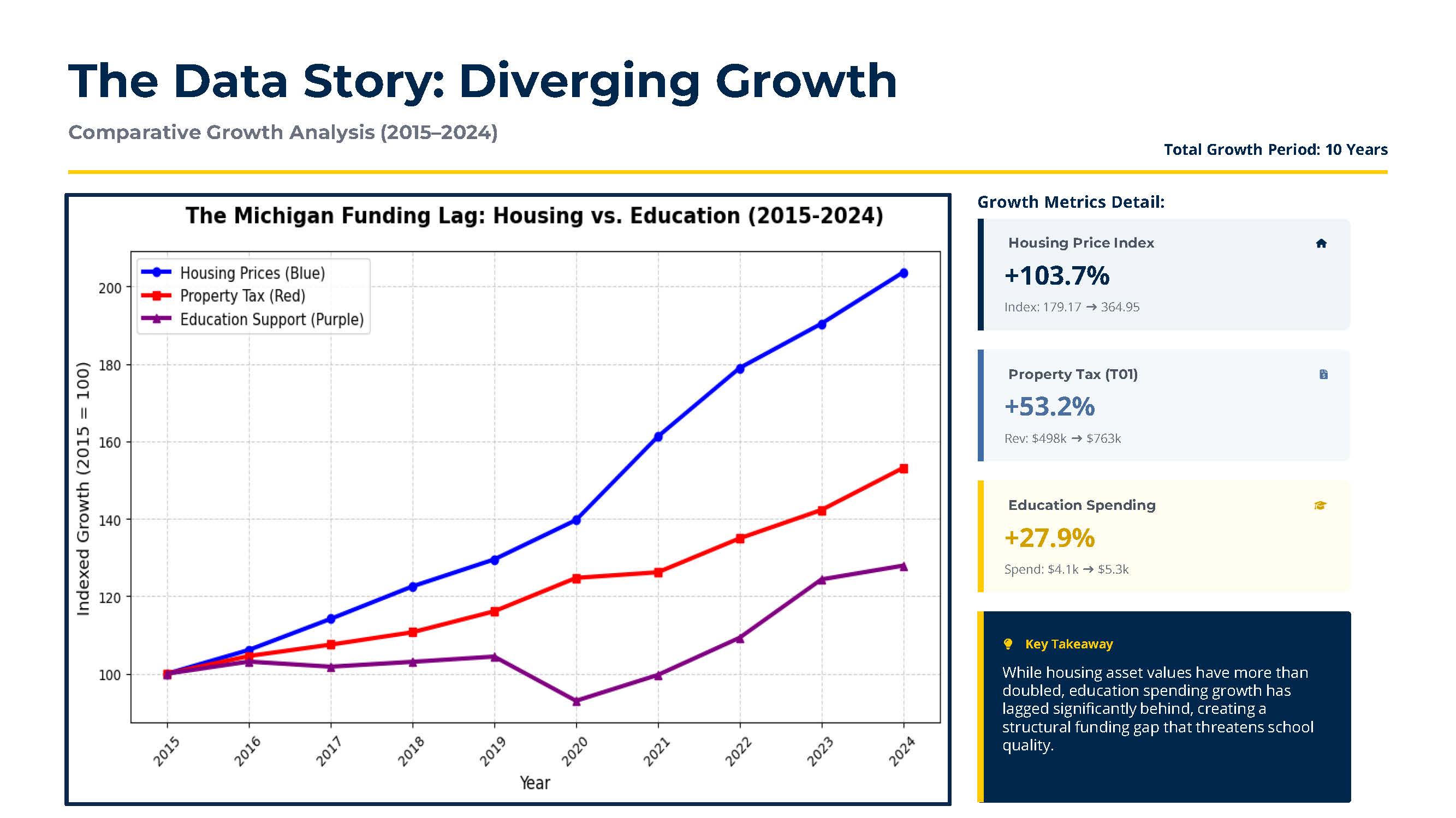
+103.7%
Housing Price Index growth vs. education spending, 2015–2024
2nd
Place overall out of all competing teams
10
Years of Michigan housing, tax, and education data analyzed

The Challenge
3 Public Datasets
Analyze three independent datasets covering taxation, education spending, and demographics.
Find the Story
Discover a meaningful problem, support it with data, and propose a practical solution.
6-Day Sprint
Clean, analyze, visualize, and present our findings in less than one week.
My Approach
Step 01
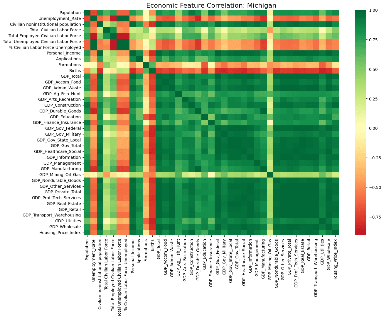
The datathon didn’t give us a problem statement; it gave us three public Excel datasets covering Michigan property taxes, education spending, and demographics, with no predefined direction. Our team spent the first stretch of the sprint exploring ten years of data together, looking for a relationship meaningful enough to build a story, and a recommendation, around.
Property Tax
Data
County-level property tax revenue trends across Michigan, 2015 to 2024.
Education
Spending
Per-pupil and total K-12 education expenditure across Michigan over the same decade.
Population & Demographics
Census population, age, and household composition by Michigan county.
Step 02
I volunteered to take on the Data Scientist role because I wanted hands-on experience applying Python to a real analytics problem, not just Excel. I built a workflow connecting Python to our multiple Excel files, using Pandas to clean, merge, and analyze the data, and Gemini to accelerate development while I validated every output myself, a workflow the rest of the team could rely on for the rest of the competition.
Python
The core language for the whole workflow, run inside Jupyter Notebook so I could iterate on each dataset and see results immediately, cell by cell.
Pandas
Needed to clean, merge, and reshape three separate Excel files into one consistent dataset I could actually analyze.
Matplotlib
Needed to turn the indexed growth calculations into the line charts that made the housing-vs-education gap visible at a glance.
Gemini
Used to assist me in coding the output, accelerating development while I validated every result myself before it went into the analysis.
Step 03
With the relationship clear, I turned to building the deliverables that would carry the story: a Jupyter Notebook pipeline using Pandas to process the data and Matplotlib to visualize it. The code and chart below are the actual output, the same visuals that became our final presentation and gave the team’s recommendation its evidence.
# Index each series to 2015 = 100 so growth is directly comparable
mi_trend[‘HPI’] = (mi_trend[‘Housing_Price_Index’] / base[‘Housing_Price_Index’]) * 100
mi_trend[‘Tax’] = (mi_trend[‘Amount’] / base[‘Amount’]) * 100
mi_trend[‘Edu’] = (mi_trend[‘GDP_Education’] / base[‘GDP_Education’]) * 100
plt.plot(mi_trend[‘Year’], mi_trend[‘HPI’], label=’Housing Prices’, color=’blue’)
plt.plot(mi_trend[‘Year’], mi_trend[‘Tax’], label=’Property Tax’, color=’red’)
plt.plot(mi_trend[‘Year’], mi_trend[‘Edu’], label=’Education Support’, color=’purple’)

This exact chart (code and output) is the one that shaped the final presentation and the team’s recommendation.
Outcome
Product Delivered
As the team’s Data Scientist, I built the Python analytics workflow and the visualizations that turned three independent public datasets into a clear, evidence-based narrative, the analytical foundation for our team’s presentation and recommendation.
🏅 2nd Place
Michigan Business + Tech Datathon
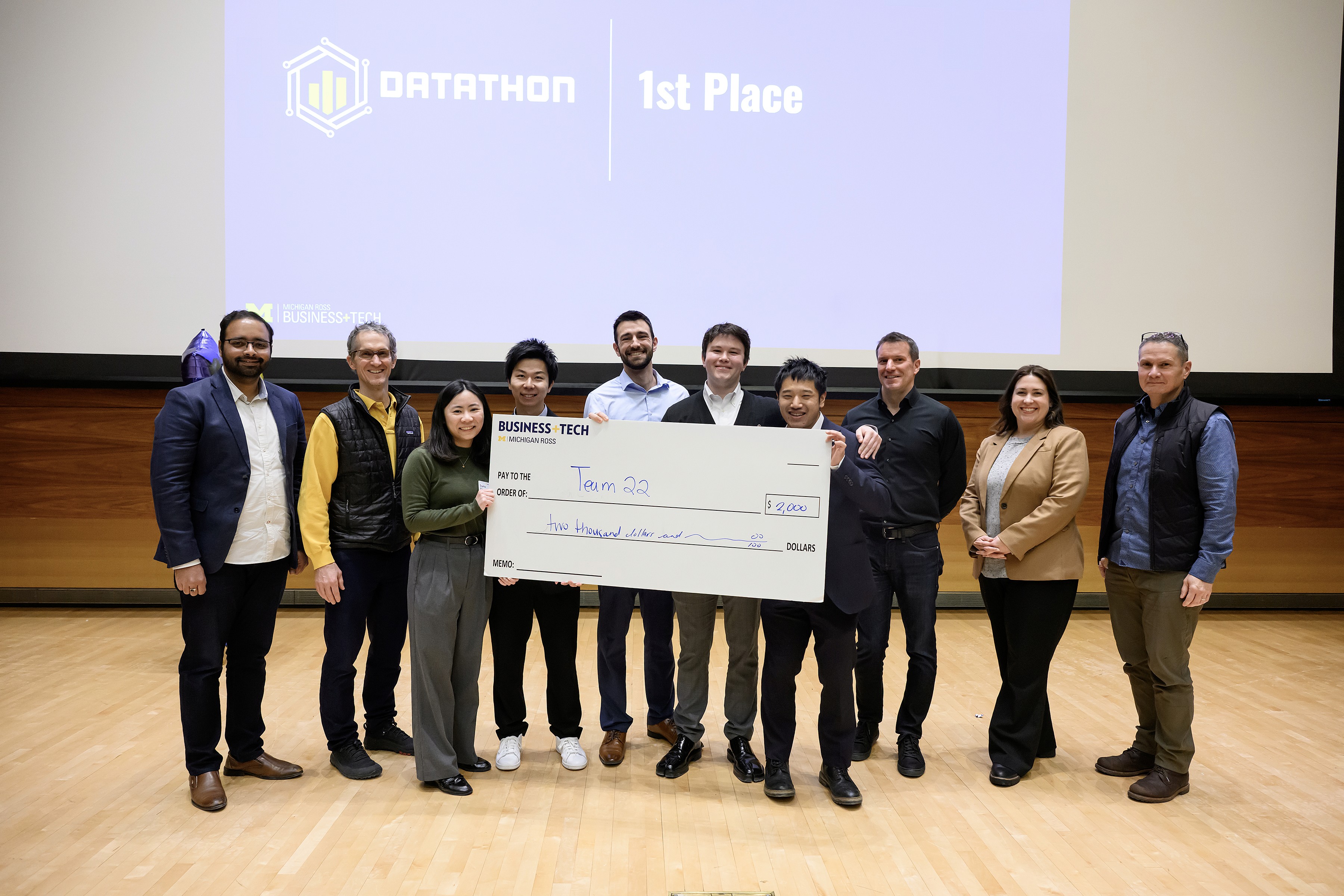
Our team’s combination of technical analysis, business strategy, and evidence-based storytelling earned 2nd Place even though it says 1st Place 😂.

👨💻 Becoming a Data Scientist
Owning the Title
I volunteered to become the team’s Data Scientist because I wanted to understand what that career path actually looked like. At the start, I saw myself as someone learning Python and experimenting with analytics.
Throughout the project, I built an end-to-end analytical workflow, processed multiple datasets, generated the visualizations used throughout our presentation, and helped turn raw data into actionable insight.
After earning 2nd Place, I realized I had already been doing the work of a Data Scientist. That experience gave me the confidence to embrace the title, and I’ve continued identifying and growing as one ever since.