Case Study: Fintech Product Strategy
From Interest to Investment
Redesigning IPO Club’s investor platform: solo research, brand, and product work in a regulated, high-trust market.
Product Design
Brand & Marketing
UX Research
Client
IPO Club
Timeframe
Jun 2025 – Sep 2025
Role
UX Research & Brand Marketing (solo)
Team
Manager, 2 Business Analysts, Isaac
Tools


+150%
New-user signups within one week of onboarding rollout
+839%
Site traffic following the full redesign and SEO pass
5
New investors secured via the redesigned pitch materials

🛠️ What I Owned
Throughout this engagement, I owned strategy and execution across three connected areas of the investor experience, not isolated tasks, but decisions that shaped how IPO Club earned investor trust.
Website Strategy & Redesign
Led the redesign of IPO Club’s investor platform to improve clarity, navigation, and credibility.
HubSpot Investor Onboarding
Designed and implemented the onboarding workflow that reduced activation friction and drove a 150% increase in conversion.
Company Branding & Investor Narrative
Directed brand strategy across the platform and investor-facing materials, including the pitch deck.
Challenge
The website, the onboarding experience, and investor communications each told a different story: inconsistent messaging, a confusing sign-up flow, and pitch materials that clashed with the brand. That fragmentation created friction and reduced confidence for prospective investors, and it showed up in the numbers: a sub-1% conversion rate on a platform meant to serve accredited investors who needed to trust the fund’s history before acting on anything.
Decision 01: Website Strategy & Redesign
Demographics
Mid-50s · Coastal (SF, NY) · Accredited investor, net worth $1M+
Pain Points
Unclear onboarding discourages signups. Investor decks lack narrative clarity. Requires trust in the fund’s history before moving forward.
Goals
Diversify into late-stage tech and resilience sectors. Access trustworthy opportunities. Balance liquidity with long-term potential.
Design Implications
Redesign for high-net-worth investors. Streamline onboarding to cut friction and respect time. Refine the pitch deck with clear visuals and story.
✅ Led Website Redesign
This research made the objective clear: investors weren’t going to trust a platform they couldn’t quickly understand. I led the redesign of IPO Club’s website around a single goal: make the platform easier to understand, simplify navigation, and communicate credibility at every step. The market comparison and the redesign itself, below, show how that decision played out.
Evidence: Market Positioning



Evidence: The Redesign
Every change here served the same goal: reduce the effort it takes an investor to trust what they’re looking at. I redesigned the footer, company page, and news section, segmenting content, clarifying navigation, replacing the newsletter block with a direct CTA, and prioritizing readability over density, so the platform read as credible on first glance, not just after digging.
Before

After
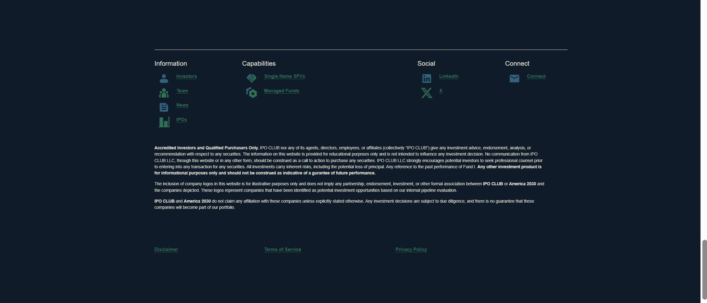
Replaced the newsletter signup block with a clear contact CTA and grouped links into scannable sections with modern icons — cutting clutter so visitors find what they need in one glance.
Before
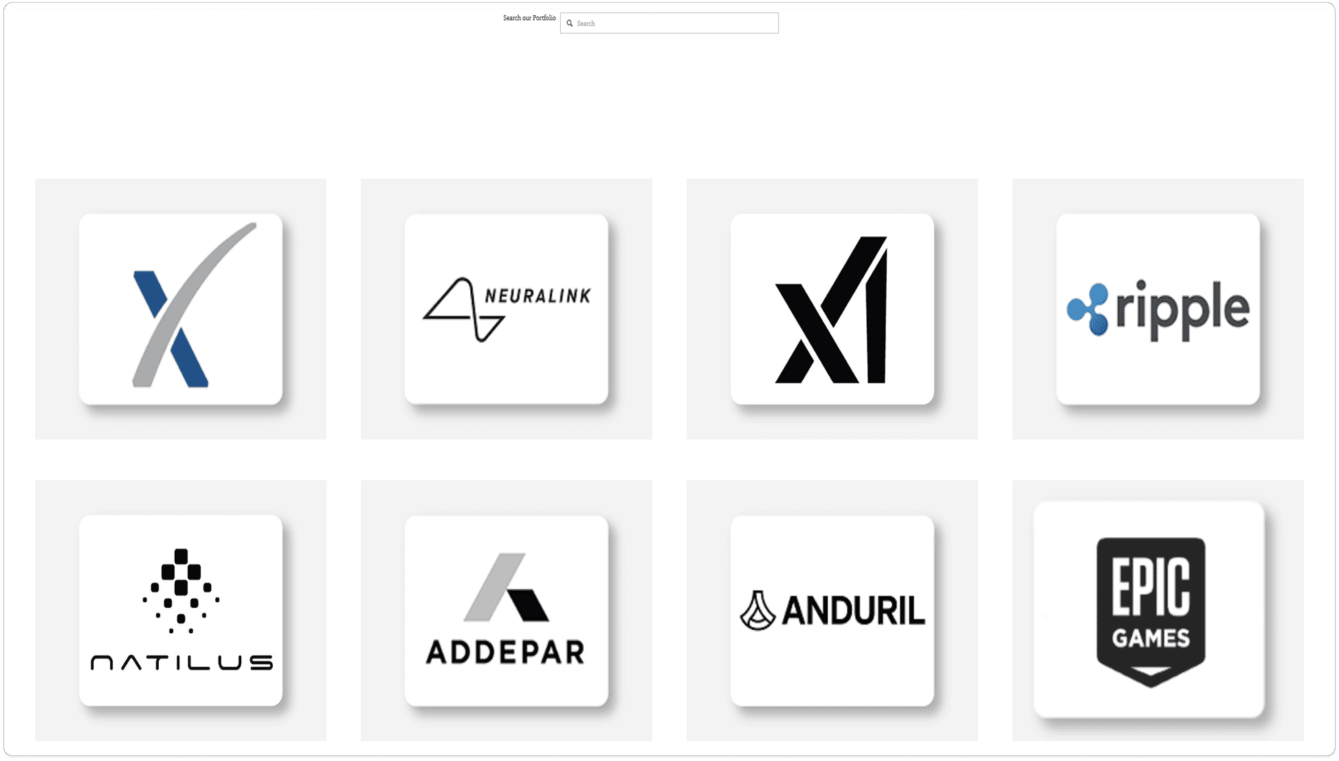
After
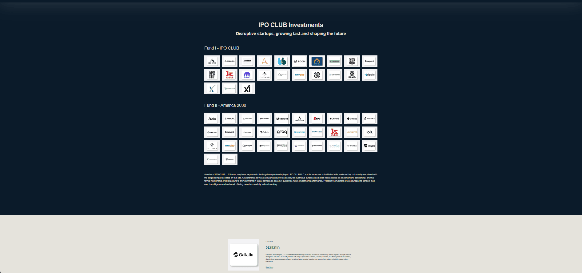
Replaced the plain white portfolio grid and search bar with a branded, structured layout — reinforcing IPO Club's identity instead of feeling like a generic directory.
Before

After

Cut a dense wall of small article cards down to four featured stories with richer detail and a clear 'View More' path — prioritizing readability over density.
Decision 02: HubSpot Investor Onboarding
Before

After
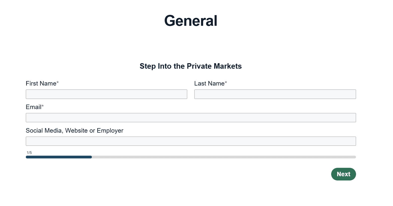
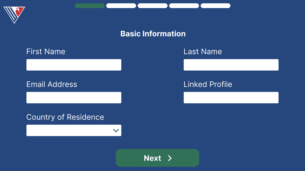
Early concepts explored IPO Club's full navy brand system. The shipped flow was rebuilt inside HubSpot's platform constraints — trading some visual identity for a faster, compliant, on-brand-as-possible onboarding.
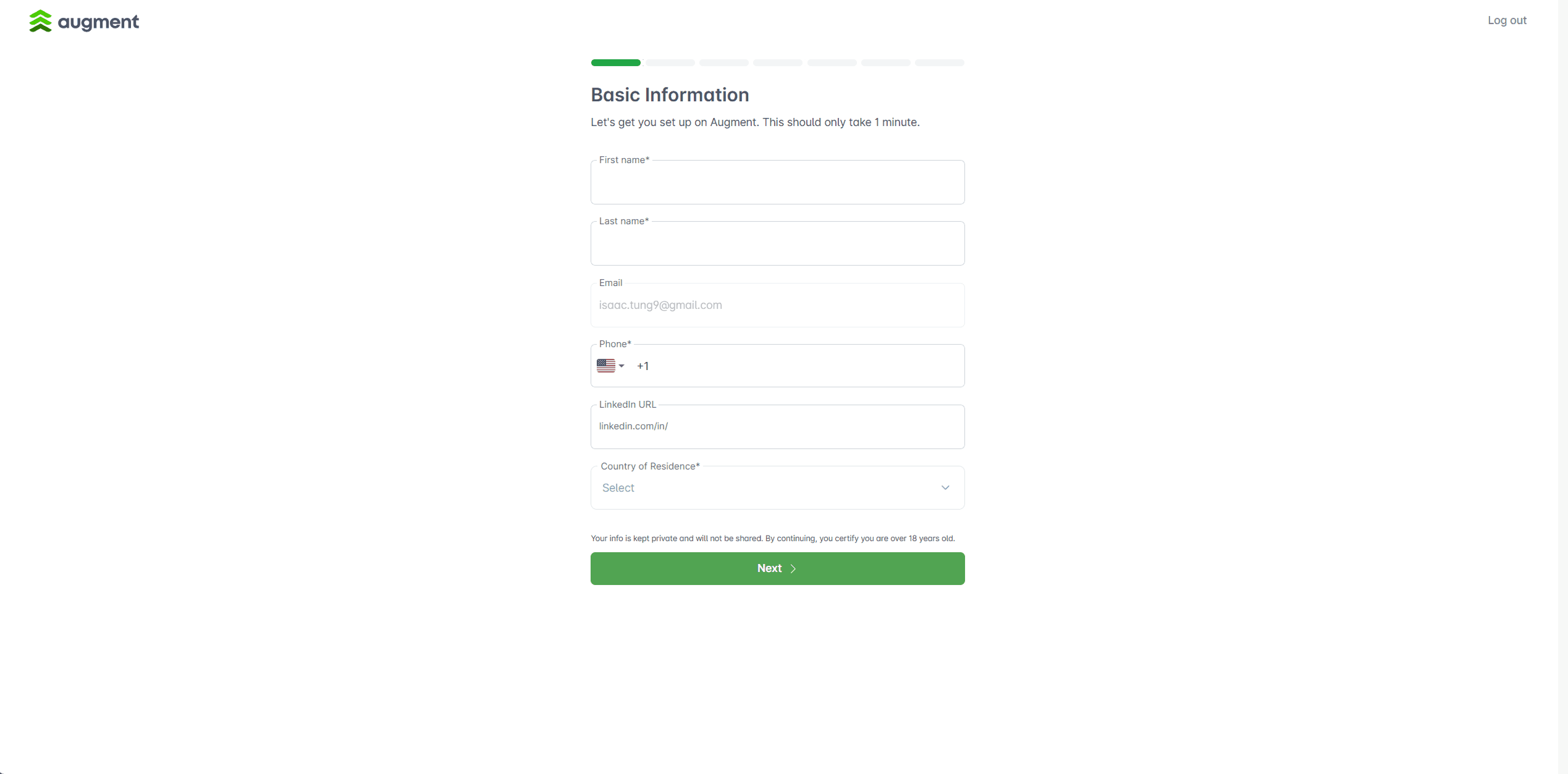
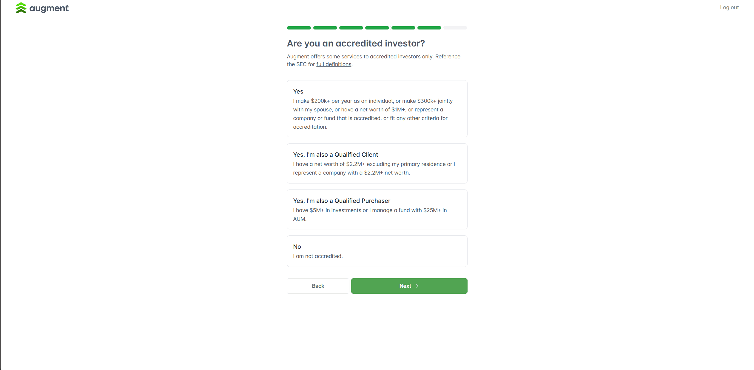
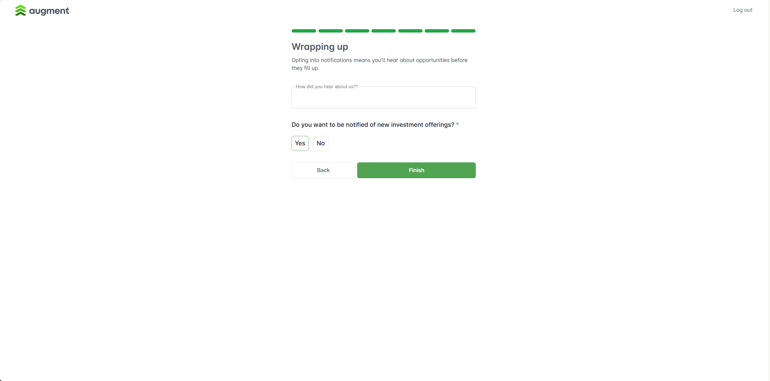
Inspiration: Augment
Speed as strategy
Minimized steps and decision fatigue, turning traffic into conversions faster.
Single transaction clarity
Centered onboarding around one clear buy-or-sell action to reduce complexity.

Compliance without friction
Integrated the accredited-investor verification seamlessly into the flow rather than gating it upfront, the same regulated-system pattern that applies anywhere a compliance check has to coexist with a good user experience.
Benchmark relevance
These qualities directly map to IPO Club’s challenge: balancing compliance, clarity, and conversion.
Rough Sketch
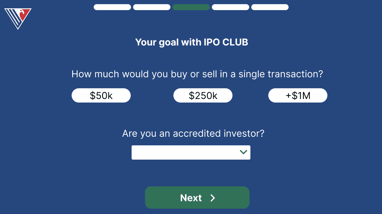
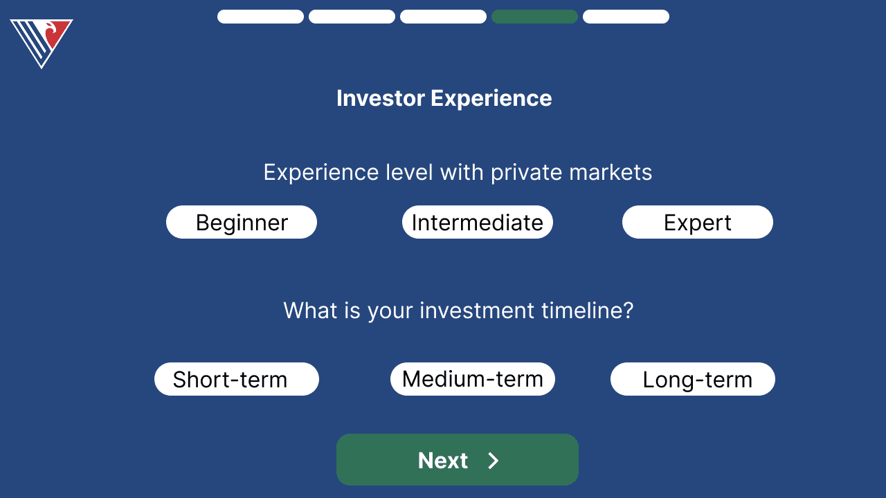
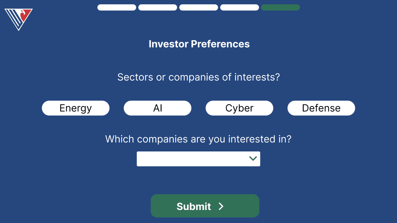
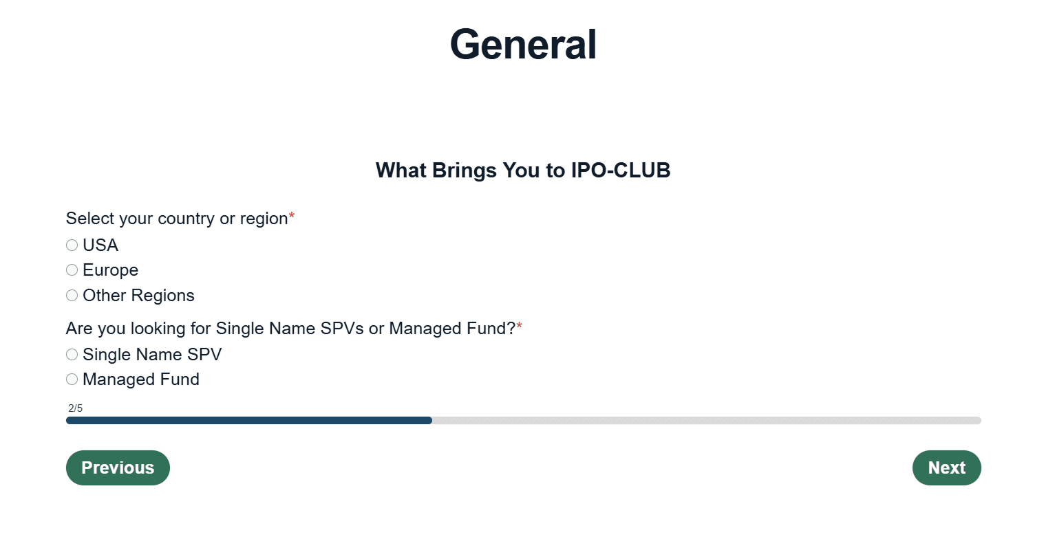
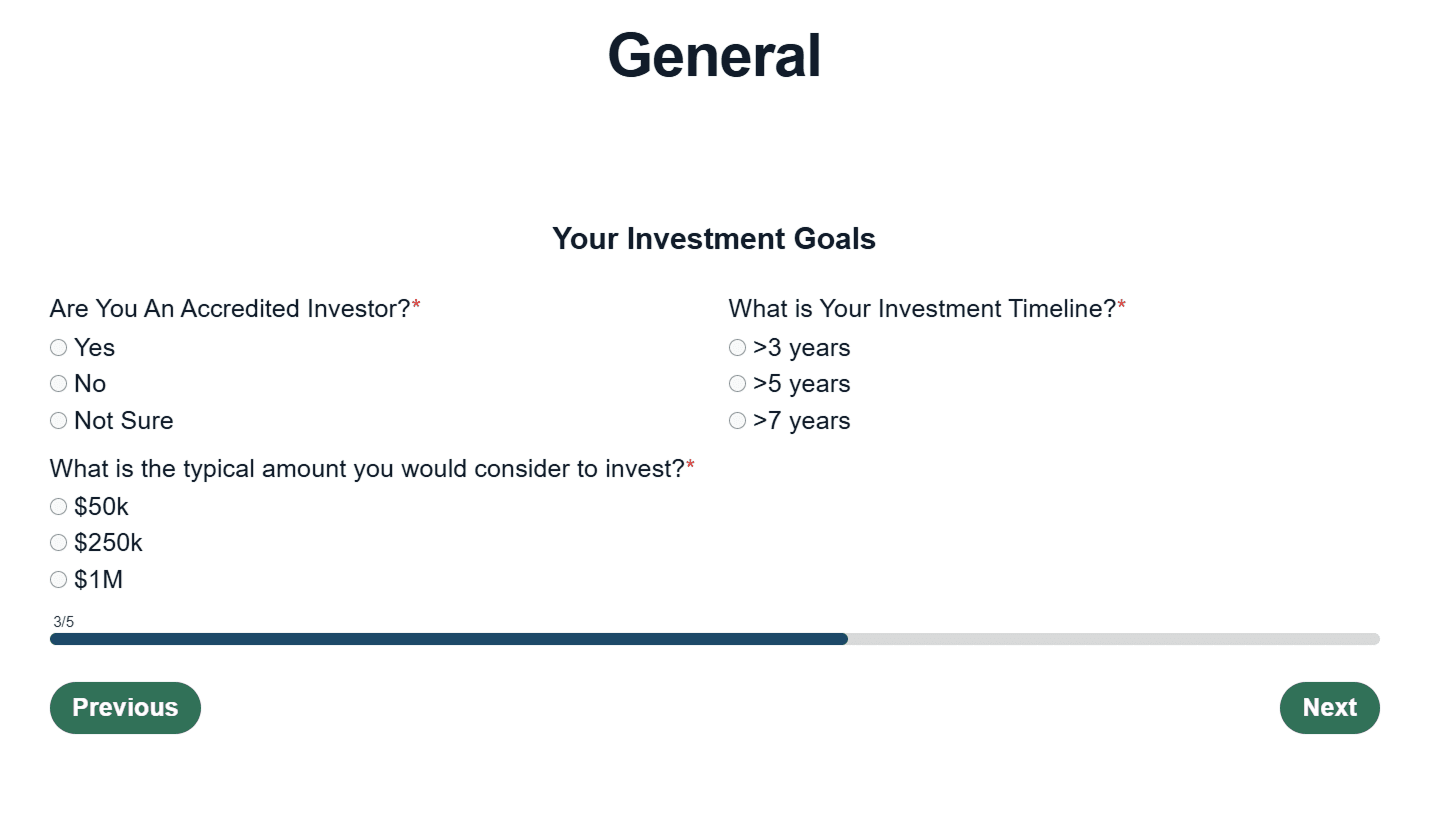
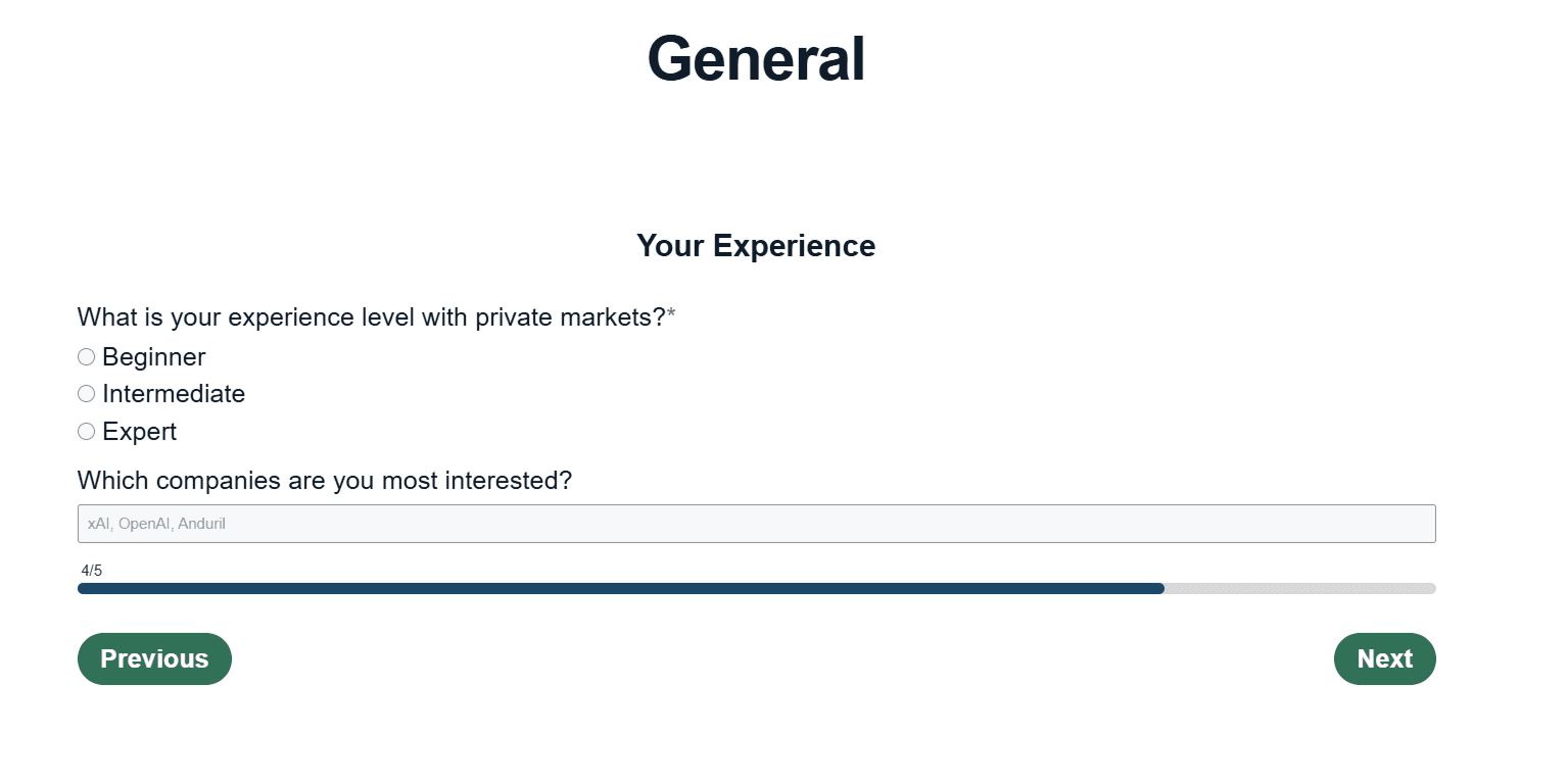
Sketched the full six-screen flow in Figma before touching HubSpot: identity, intent, goals, experience, and preferences, ending in a confirmation screen, aiming to stand out with color, pill-style selections, and a top-to-bottom flow.
Step 1: Identity & Contact
Step 2: What Brings You to IPO Club

Step 3: Your Goal with IPO Club
Step 4: Investor Experience
Step 5: Investor Preferences
Confirmation: Submitted

Challenges
Rigid Data Tracking
Keywords in HubSpot were different from what we were used to when onboarding users.
Default Branding
We could not incorporate IPO Club’s colors as much as planned in the platform, so we leaned on the website instead.
Design Limitations
HubSpot’s design was restrictive and leaned toward structured data workflows, which limited layout flexibility and customization.
Execution
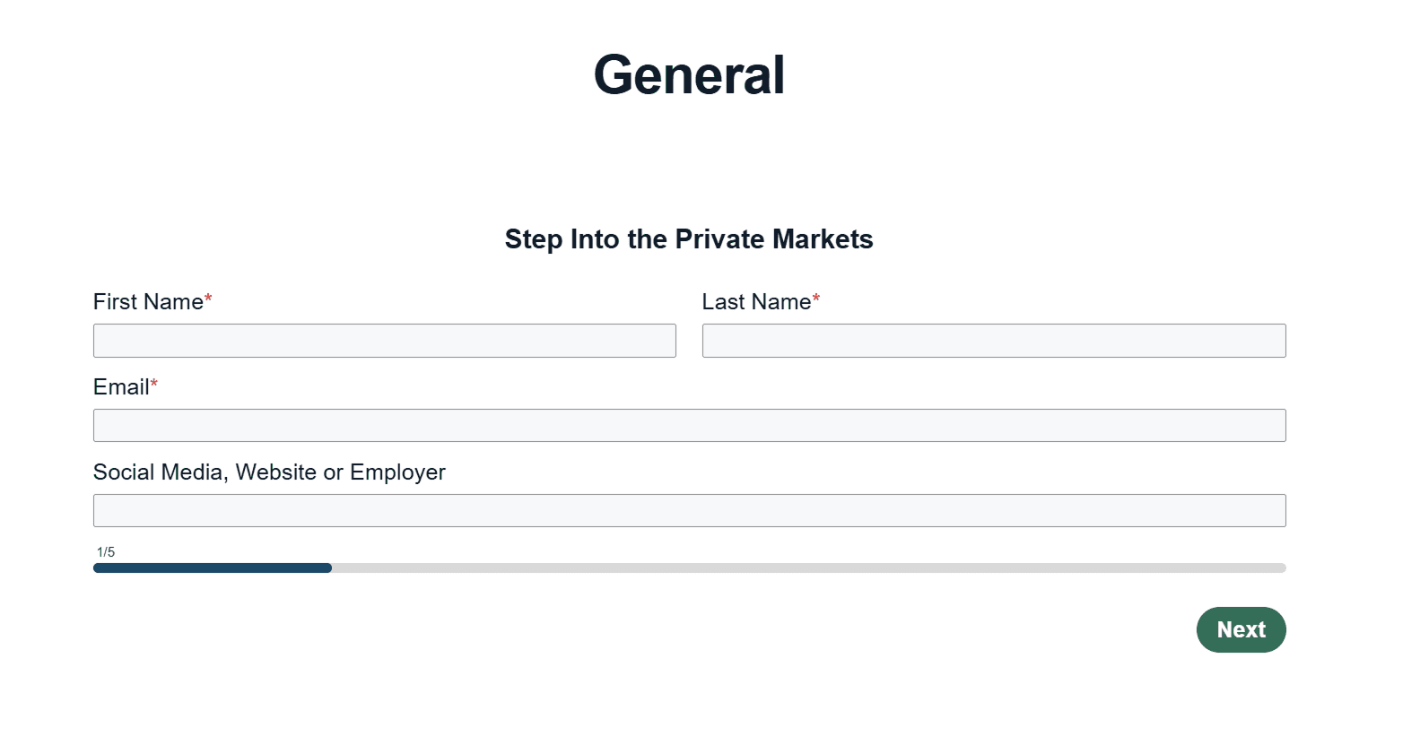
✅ Designed HubSpot Onboarding Workflow
150%
increase in onboarding conversion
Onboarding was the moment IPO Club either kept an investor’s attention or lost it to friction. I designed and implemented this workflow in HubSpot specifically to reduce activation friction after signup: the accredited-investor compliance check runs quietly in the background instead of gating the flow upfront, and every step was cut down to what was strictly necessary. That single decision drove a 150% increase in onboarding conversion.
Decision 03: Company Branding & Investor Narrative
When the manager built out IPO Club’s first website and social media, there was no brand in mind behind it: no defined logo system, typography, or color palette to keep things consistent from page to page. I raised that gap and made the case that the company needed one: a real identity, not just whatever looked good in the moment. I directed that effort, defining the logo, typography, and color palette, and it didn’t stop at the platform: two business analysts had already built the investor pitch deck on a dark-UI template with flashy interactions, without consulting me on branding, typography, or color, so it clashed with the identity I was building everywhere else and fragmented the narrative across slides. Carrying that brand into the deck was the next necessary step.
Typography
Standardized on Arial across every slide for readability and a consistent hierarchy.
Logo Refinement
Added a white outline to the logo so it stayed legible across every slide background.
Color Palette
Deep Navy, Green, Light Neutral, Blue Accent, reinforcing the companys established identity.
✅ Directed Brand Strategy
These typography, logo, and color decisions weren’t slide-deck polish; they were the same brand system I’d built for the website, applied consistently so investors saw one company, not three different ones.
Brand Evolution
No Defined Brand
→
Brand Principles
→
Logo, Type & Color
→
Applied Everywhere
Website, social media, HubSpot onboarding, and the investor pitch deck: one identity, applied consistently across every touchpoint.
Extending the Brand
The pitch deck was the last place investors experienced IPO Club’s brand, and the first version didn’t match it. I rebuilt the key slides with consistent typography, hierarchy, and the brand’s own color palette, carrying one identity from the homepage to the pitch.
Before

After
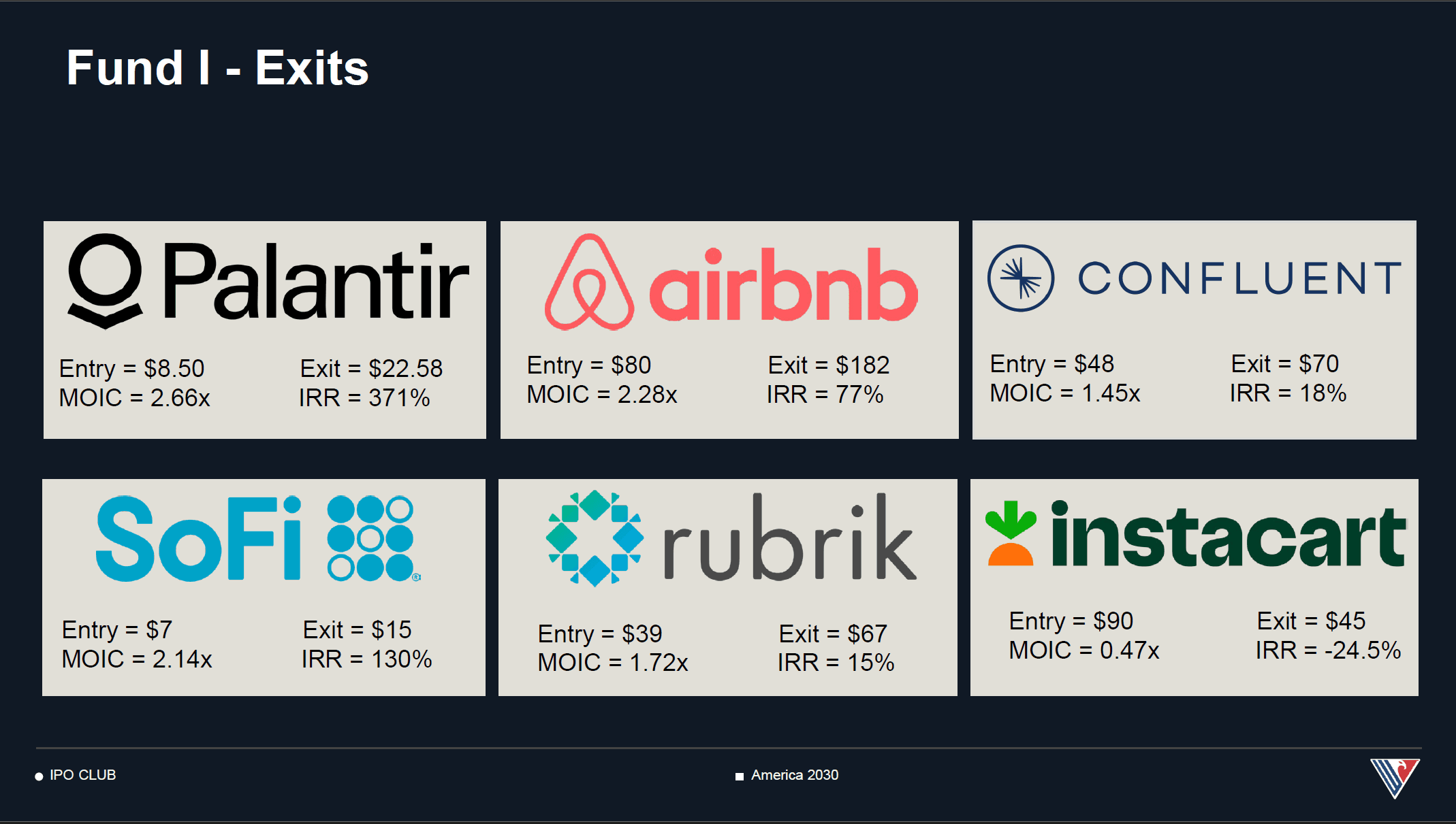
The original slide had warped characters and overlapping text that hurt readability. Reformatted the layout and typography to be skimmable and investor-ready.
Before
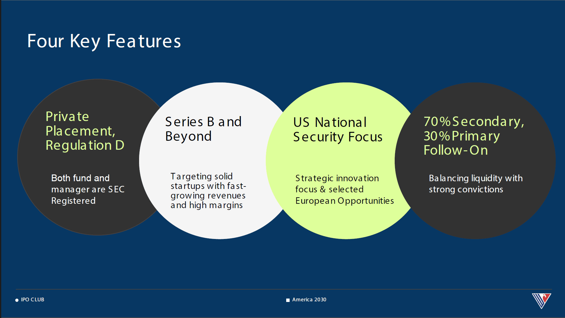
After
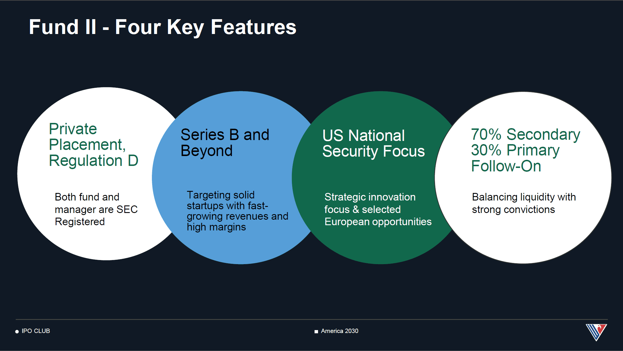
Applied IPO Club's exact color palette and typography from the website, so the pitch deck reinforced the same brand identity investors would see online.
Outcome
The website redesign, the onboarding workflow, and the brand system weren’t independent deliverables. Together, they created a single, cohesive investor journey: from the first website visit, through onboarding, to every piece of investor communication after.
150%
increase in onboarding conversion
191K
monthly platform users
Stronger
positioning and investor-ready communications
That’s the throughline of this project: not a redesign, not a workflow, not a rebrand, but a more trustworthy, cohesive investor experience, end to end.
Reflection
Solo ownership, first time
Designed a product solo for the first time, a role that deepened my understanding of product management.
What I would improve
Despite strong results, we never produced explainer videos for the platform, an area I was excited to explore and would prioritize with more runway.
Why this shaped my path
My interest in venture capital reflects how investing can drive innovation. This project became a catalyst for pursuing my dual MBA/MSI degree.

Isaac Tung transformed IPO Club’s investor experience by leading the website redesign, onboarding strategy, and brand positioning, creating a more trustworthy, cohesive journey from first impression to investment.